Member Site Homepage and Navigation Redesign
Role: Lead UX Researcher
Tools: Miro, UserZoom
Timeline: Feb 2023 - Sept 2023
The Member Site is UPMC Health Plan’s member facing health insurance portal. Members can log in to access a variety of health insurance information, documents, and wellness resources. The last time the Member Site’s home page was worked on was over 4 years ago. Due to this long gap in UX evaluation and negative feedback from consumer insight reports, an initiative was started to redesign the entirety of the Member Site, starting with the home page and navigation.
Project Timeline
Discovery
During this period, I wanted to gain insights into how people approached and used insurance account homepages and navigations.
Some target questions include:
What role does the member site play in our member’s health journeys?
Out of all the features on our site, which ones are the most important to members?
What features belong on the home page compared to in the navigation?
Analysis of discovery survey and card sort done in Miro
Participants
An account home page is something that will be used by a wide range of people with varying familiarity and across lines of business. Because of this, throughout this entire process I decided to recruit participants from the general population, with an even spread of individuals with Commercial, Medicare, and Medicaid plans.
Methodology and Analysis
In order to get a reliable quantitative measure of importance and preference, I used created surveys through Userzoom. In addition, I used closed card sorts to gather feature priority data.
Result synthesis was done through Miro and Userzoom
Key Findings:
Impact
Helps to prioritize what is most important for people to be able to access easily. These items would be good candidates to have on the home page.
What do people log in for?
Claims/payments
Checking what’s covered
Check prescriptions, appointments, and test results
Find a doctor
Impact
Helps to determine if there are any features that should be removed from the site entirely, as well as what’s important to people that we should focus on displaying.
Feature priority
Participants sorted a list of features available on our member site into 4 categories:
Very important (16 features)
Nice to have (8 features)
Less important (6 features)
Not important to me (2 features)
Impact
When combined with the feature priority results, I was able to create an overall prioritization chart to help determine the most important things to have on the home page, as well as key items in the navigation that need to be easy to access.
What belongs where
Gained a list of what participants viewed should go on a home page compared to within a navigational menu.
Competitive Analysis
Analysis of competitive research done in Miro
In order to stay relevant in the health insurance market and see what UPMC might be missing, I conducted a competitive analysis with United, Highmark, and Anthem. Instead of just noting what each company did and following suit, I wanted to understand the successes and pain points of each competitor to give a confident recommendation of what approach to take with the designs. Again, I recruited general population participants with a range of insurance type through Userzoom to evaluate the competitor pages.
Some coworkers generously shared screenshots of their insurance account homepages from these competitors, which I used during this test.
Key Findings:
What worked well?
Organization and layout
United and Highmark received many positive comments on their layout and organization, and both heavily use boxes or cards to separate sections. However, they also received many comments about too much information on the homepage, so balance is key.
Visual display of deductible
This was well liked across all competitors, and consistently top rated as one of the most important things on the homepage. Graphical representations were especially well received!
What didn’t work well?
“Miscellaneous” type categories
Whenever a navigational bucket seemed to be just a collection of whatever is left over, participants had negative comments about the organization.
Duplicate or specialized naming
Participants expected the navigational menu to offer new features that were not already available on the homepage. They also became confused at specialized names for features such as “Smartshopper” and “Spotlight”.
Menus need to visually stand out from the page
Participants were confused when navigational menus were difficult to find on the home page.
Clearly differentiated navigation categories
Navigational categories need to be named in a way to clearly show that they are different from one another. For example, a competitor that had categories called “care” and “support” was negatively received.
After handing off these results, the designers got to work crafting a new home page!
Evaluating new designs
The designers came back with a couple new designs for the home page and navigation.
The two home page options were essentially the same format, but with different pieces of information in the top 3 column section. The “info” top version has more account related information, such as primary care physician details and wellness rewards. The “activity” top version has more spending related information, such as spending summary and claims.
There were also two different navigation options, a traditional megamenu and a more unique “split navigation style” where the secondary navigation is separated below a banner image.
During this round of research, I focused on testing perceptions and preferences around these new designs. My goal was to find out if this new approach improved the experience, and what needs refinement.
Although I would have loved to conduct member interviews, budget constraints meant that I would have to rely instead on Userzoom and their general population panel. Instead, I utilized the recorded “talk-out-loud” feature of Userzoom to still be able to gather some in-depth qualitative data from usability testing.
Results were again synthesized through Miro and Userzoom
Homepage evaluation analysis done in Miro
Navigation evaluation analysis done in Miro
Key Findings:
1st Impressions
Overall, the new home page designs have much better first impressions compared to the current home page. Using a modified version of the Microsoft Desirability Toolkit, I evaluated how the current home page and new designs were described. To the right, you can see that there was a significant improvement in the types of adjectives used to describe the new designs.
Impact
Although it appears people prefer the “activity” top, the “info” top is actually better suited to their needs and desires.
Activity vs. Info Top
Between the two versions of the homepage the designers came up with, the “activity top” version was perceived as more comprehensive and personalized. However, when participants were asked to create their own homepage by placing different pieces of information in available spots, they created a homepage more similar to the “info top” version.
Overall homepage created when participants could “drag and drop” information where they wanted it
Card format adopted in new designs
Cards worked well
Taking inspiration from what worked well on competitor sites, the new designs feature a card layout on the home page to separate different pieces of information. This approach was well received and contributed towards the increase in positive adjectives used to describe the new designs.
What people say is not what they need
When A/B testing the two navigation versions, most people said they preferred the “split” version, but usability recordings indicated that the megamenu performed much better.
After presenting these results, the designers made refinements where necessary and worked on creating a high fidelity homepage design.
Information Architecture
After finishing up research on the home page, I turned my focus to redesigning the information architecture of the entire member site. Because several new features will be added in the coming years and several other features are being removed, the IA of the site needed re-evaluation.
Open Card Sort
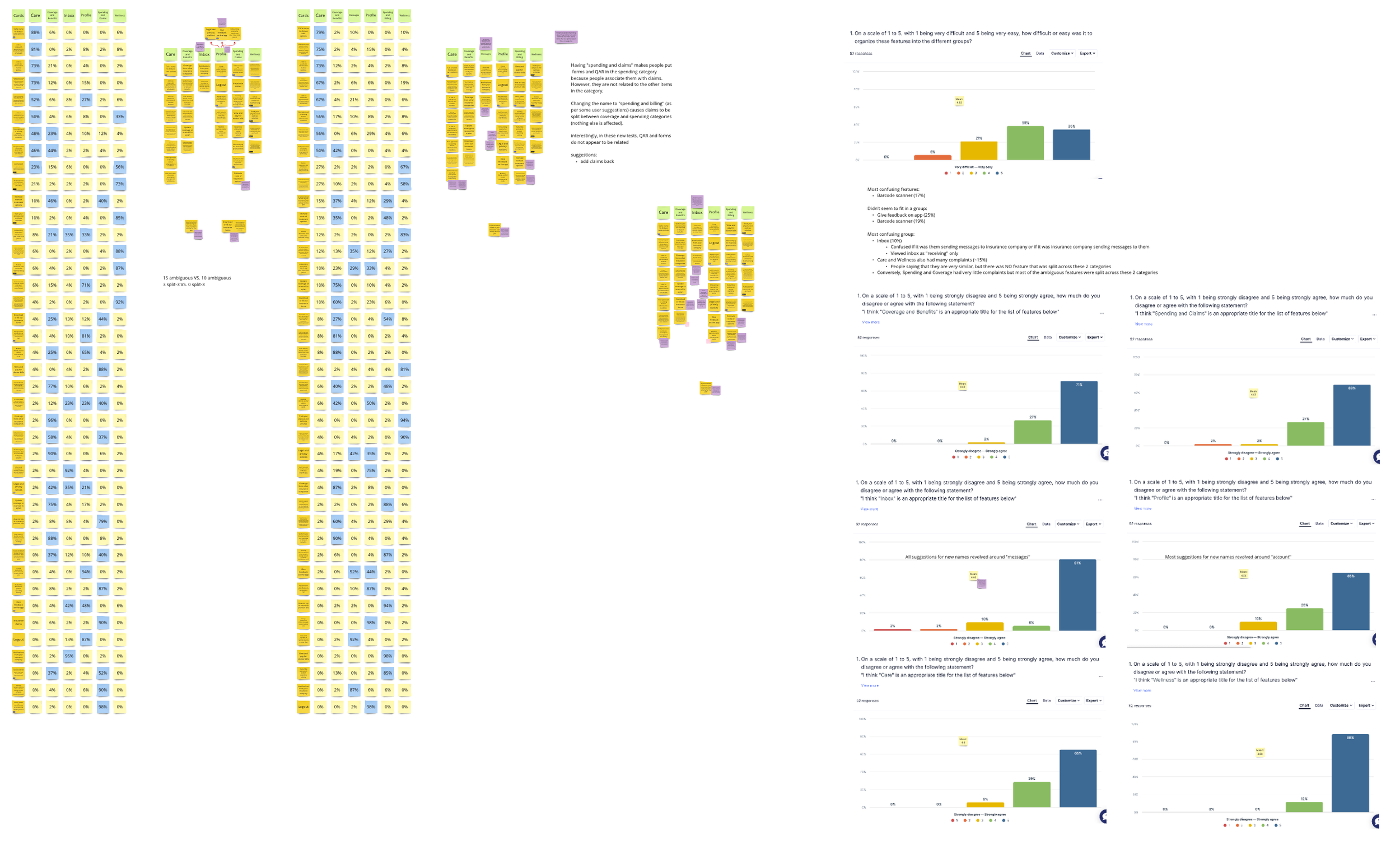
I first conducted an open card sort to determine overall groupings of features. Participants were given descriptions of all the features and asked to group them in whatever way they thought made the most sense. These results were synthesized using Userzoom’s built in card sort analysis tool, as well as creating a visual representation of feature connections in Miro.
Visual relationship grouping of open card sort results in Miro
Results:
Around 7-10 major groups were created. After discussing with the designers, we determined 7 groups to be the better route. Broadly speaking, we ended up with:
Money/finance group
Insurance plan group
Care group
Wellness group
Account/settings group
Inbox group
Contact us group
Closed Card Sort
Closed card sort analysis done in Miro
Next, I conducted a closed card sort to validate my findings from the open card sort and to evaluate names for groupings
The designers came up with preliminary names for each of the 7 groups, which were used during this test:
Spending and Claims
Coverage and Benefits
Care
Wellness
Inbox
Profile
Participants were given descriptions of all the features and asked to organize them into the 7 groups above.
Results:
Through the course of the testing, “Spending and Claims” was changed to “Spending and Billing” due to people initially placing “Forms” and “Documents” into this group when they weren’t related to anything else in the category.
There were also some features that shifted categories:
EOBs (Explanation of benefits)
Coverage and Benefits → Spending and Billing
Why?
People place Explanation of Benefits in Coverage and Benefits because the of the shared “Benefits” in their names, regardless of what an EOB’s purpose is
Since claims is in Spending, and EOBs are related to claims, I would recommend EOBs to go into Spending
Document Archive
Coverage and Benefits → Inbox
Why?
People think of email when they see “Inbox”
Email is where they receive things
Documents that they receive from their insurance company should be in “Inbox”
Preventative Screening Incentive
Care → Wellness
Why?
The term “preventative” leads people to wellness
ID Cards
Coverage and Benefits → Profile
Why?
People think ID cards are personal information
Personal information should belong in “Profile”
At this point, we had an interim information architecture outline:
Feature Label Testing
Feature Label analysis done in Miro
Over the last few years, many core features have been added to the member site without proper thought into naming, and there are many planned features that are currently unnamed. Because of these changes, the designers wanted to re-evaluate the names of all features within the site.
To do this, I ran a baseline test to evaluate the effectiveness the current feature names had. This was done by presenting the feature name, and asking participants to describe what they believed the feature to be/do. I then ran two feature name creation tests in which I asked participants to create names based on descriptions of the features.
Results:
Ultimately, there were 14 features that needed no change in their name, 8 features that could potentially improve understanding with a name change, and 12 features that were recommended to have a name change. To finalize the names, I ran a workshop with the designers where I presented user generated names and we collaborated to decide on each new name.
Workshop with designers to determine new feature names
Tree Testing
Tree test analysis done in Miro
Finally, I ran a tree test to validate the IA and label testing of key features that were either high usage, had shifted categories during previous testing, or the team wanted to double check.
Results:
Most features performed well, but a follow-up survey was run for the features that were problematic. Coming out of follow-up testing, there were some further name adjustments. The largest change coming out of this was the decision to create a new category specifically for “Documents and Forms” to enhance findability.
Previous Homepage Vs. New Homepage
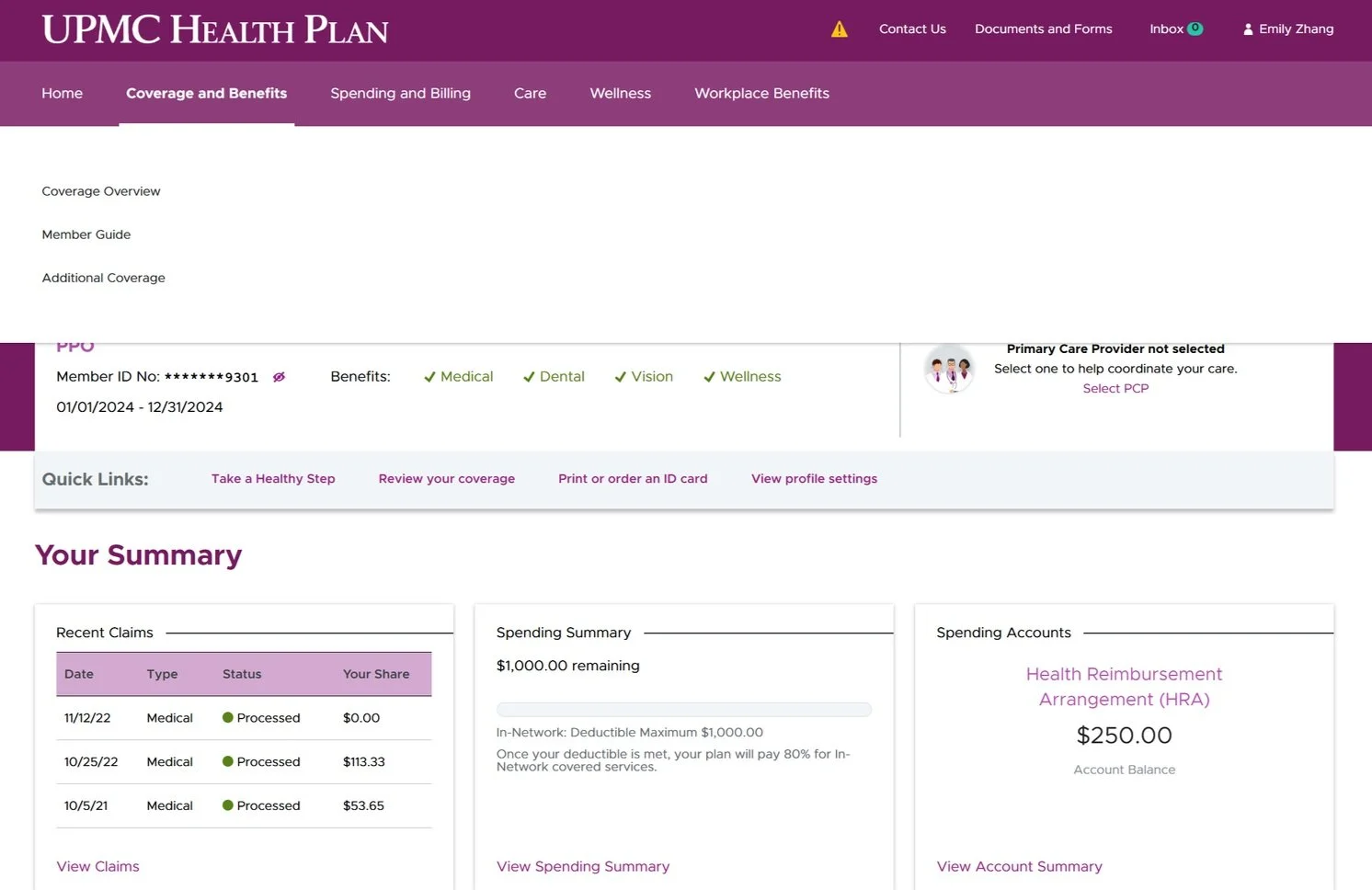
As of September 2024, the new homepage and navigation have been launched on our Member Site!
Previous homepage
New homepage
Previous Navigation Vs. New Navigation
Previous navigation
Previous navigation with secondary
New horizontal navigation menu
New navigation with secondary
New navigation with promotional space


