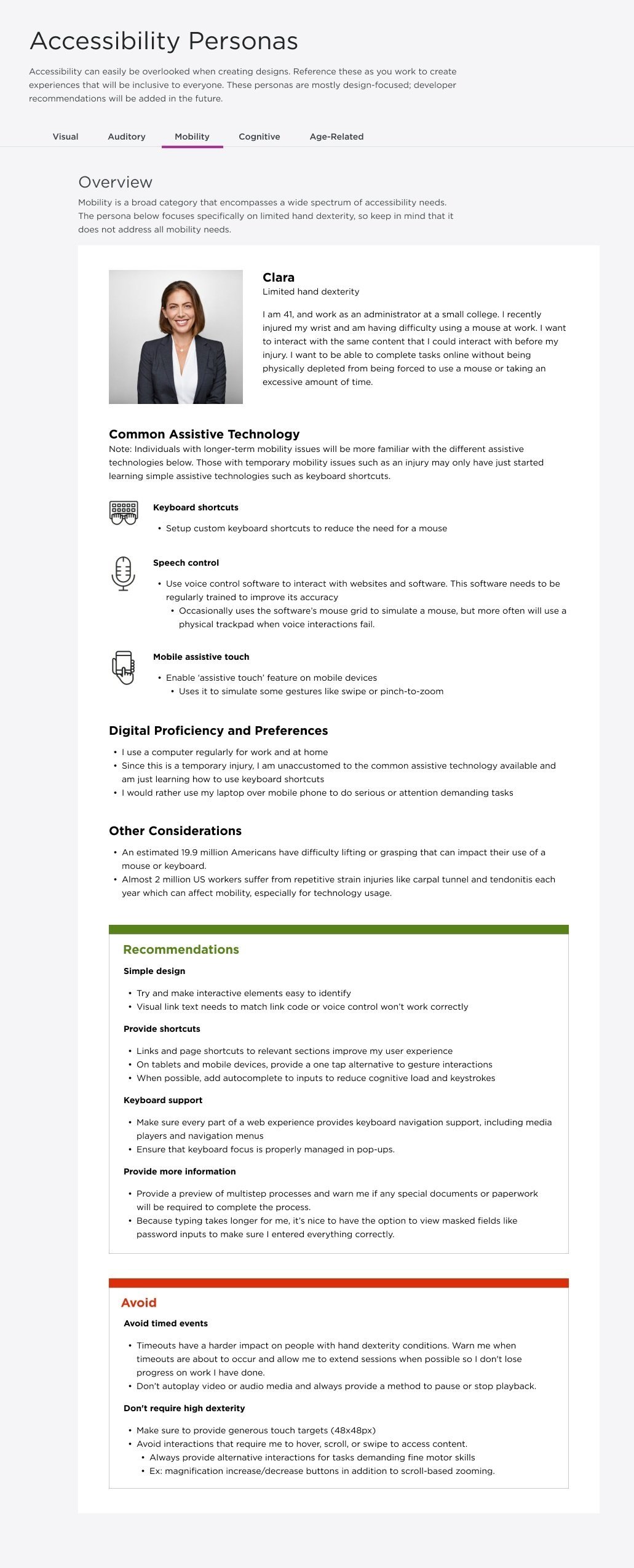
Accessibility personas and interviews
Role: Teammate, transitioned to Lead
Tools: Miro, Figma
Timeline: Jan 2022 - April 2023 (Personal Project)
UPMC is a major insurance provider in Western PA serving more than 4 million members, yet there has been little focus on making experiences accessible. As a personal side project, I worked on creating and incorporating accessibility personas into UPMC’s design system as a way to promote accessibility within the company. I started out as a teammate working on this project under another co-worker's lead, but later transitioned to leading the project.
Why Personas?
When this project started, my team decided on personas as the deliverable because we thought they would serve as the best introduction to accessibility for designers, which was our main audience. In particular, we liked that personas would:
Present a name and face to designers, making them feel that they are designing for real people and needs
Give a snapshot view so that designers are more inclined to view them (instead of having to research themselves or read through a long document)
Be able to be easily integrated into Orchid, our design system website
Be an easy enough reference so that upper management or other departments could read and understand them without any prior knowledge
Gathering Resources
Historically, our design and research team has never created or used personas during any project. Since we had no reference point, the project lead at the time decided to gather several accessibility personas from other organizations to use as references. Based on the information presented in these personas as well as our unique needs within UPMC, we decided on several main components we wanted each persona to have:
Name and image
Assistive technology used
Recommendations
Warnings/things to avoid
We also decided on several categories of accessibility needs:
Visual
Auditory
Mobility
Cognitive
Age-Related
We each chose a category of accessibility needs, read through all the personas the project lead had gathered about that category, and coalesced the information into a single persona. At the end of this process, we had all created our own version of a persona.
Iteration Workshop
Next, we held a workshop where we all presented the persona we had created and critiqued things like layout, the information presented, and organization of information.
Our workshop session in Miro
Coming out of this workshop, we decided to include some additional pieces of information:
Description of persona’s identity, including main desires
Why? We thought this description helped to enhance the feeling that these are real people with real needs
Section around digital experience and preferences (for example, in terms of device or online habits)
Why?
Section around other considerations, including statistics around a need or additional things to be aware of
Why? We thought this section added numerical value to show the importance of accessibility and also contained important facts that many people may not know about
The need to separate the “visual” category into two personas, one for blind/low vision and one for color blind
Why? These two groups had very different needs, so they were separated
The addition of more visual references and outside resources for people to really understand these accessibility needs. Below you can see a couple examples of visual references we added to help people understand how dyslexia and different visual conditions affect vision.
Why? It can be difficult for people to imagine what it is like to have an accessibility need, so visual representations can help build empathy
These visuals in particular had a lot of positive feedback from designers and marketing department members during our later workshops/presentations
Example of what words look like to someone with dyslexia
Example of how different conditions affect vision
Following this, there were some major shifts within our teams that led me to take over as the new lead for this project.
Refinement
After finalizing the layout and information we wanted to include on each persona, my team and I worked on taking the previous iteration and adjusting them to fit these new specifications. We also added additional details based on insights gained from our in-house accessibility interviews that were conducted around this time.
I also participated in organizing these interviews, particularly the heuristic evaluation, although my main focus was the persona work. Some main highlights include:
Collaborated with public site team to test the SNP (special needs plan) insurance sign-up process
Conducted a heuristic evaluation of the sign-up process to determine focus areas and key tasks
Recruited 5 blind/low vision users
Conducted interviews remotely through Microsoft Teams due to Covid-19 restrictions
Results synthesized and delivered to the public site team. Also used to enhance accessibility personas.
After completing this next iteration of the personas, we held a review workshop with designers and some individuals from marketing to get feedback, as well as suggestions for future enhancements post-MVP.
Personas during the review workshop stage
Final Changes and Handoff
Once we incorporated the feedback from the design workshop, we then moved the personas into Figma to prepare for handoff. As part of this process, we made sure to align the layout with that used in our Orchid design system website. We also held another workshop with our Orchid developers to make sure everything was in order and to see if there were any other files or things needed from their end.
After some final changes, we handed off the files through Zeplin! These personas will be available on our internal design system website for all designers to reference.
Post handoff, my team and I presented a compilation of accessibility work, including these personas, to the entire marketing department as part of an effort to promote accessibility within UPMC.


